Showing posts with label portfolio. Show all posts

10.20.2010

Client Design Board ~ California Living Room

As I've talked about recently, I am helping a friend decorate from afar. Her bedroom so far is going well. She has purchased nearly every item she needed, except for the lamps. It's pretty cool to see it all come together! Hopefully I will be able to share some "after" pictures soon.

Next we started working on her living/dining room. She was a bit undecided on what colors she wanted to go with, but offered this picture as an inspiration:


I attempted to recreate the airy, sophisticated vibe using greens and blues for the color scheme, with bronze accents. Turns out we are going to go with deeper tones than what I chose on my design board, but I thought I would share it anyway:


The living room needs a focal point, which we can create by arranging several frames above the couch, as shown. I suggest getting cheap frames from IKEA or Michael’s, then use pages from a calendar or print out pictures online (such as here) to create a fun and affordable art wall.

Since we can’t install curtains, I thought a rug would help to bring color to the room, as well as help define the living from the dining area. More color can be brought in with pillows (the fabrics used here are all from Calico Corners, and the pillow shown is from here), and with a throw blanket. The bronze and other accessories here are ideas of items she could put on the coffee table, side table, and TV console. A tall plant would look great near her window.

The mirror shown on the board (top), is for the dining area. She does not have space to add anything more than her existing round table and chairs, so I was thinking of putting this mirror on the wall behind the table with a floating shelf underneath to create a little table to add more decorative touches. 

So there you have it. Like I said, we'll be changing the colors a bit, but she really liked the art wall idea as well as all of the decorative touches. I look forward to seeing it come together! 

9.30.2010

Client Design Board ~ a California Apartment

I recently completed a design board for a client (ok, a good friend) that just moved to California and wanted to start her life as a newlywed with a stylish apartment! She already purchased all of the furniture, but seeked my help to make the place feel beautiful and cozy.

Because this is a rental that she plans to be in for only a year, we could not do anything permanent. The decorating had to come from accessories. For her master bedroom, she was inspired by a couple of images I had posted on my blog:


Estilo Home

Therefore, our goal was to add a beach-y glam vibe to her existing furniture set (similar to below). Here is what I came up with:


I started with these curtains from Pottery Barn, which I thought were the perfect way to bring in color to the room. For the bed, I suggest accenting her neutral cream/gold comforter (which she already owns) with sheets in a gold/latte color. To complete the look, I thought a pillow like this one or another with some coral in it would help bring in a little more color and pattern. Finally, I’d use a throw in orange or coral at the foot of the bed.

Above the bed, a round gold mirror such as this one would add that hint of glam. Same with the gold lamps for each side table. The version here is a bit pricey, but she could find a pair of gold lamps at many stores, or spray paint some gold (look for a lamp with a rounder, not skinny, base.) I thought it could be fun to line the shades with fabric (like this fabric) to add more color and pattern. If she wants to take the look a step further, she could consider adding long rectangular gold mirrors behind each lamp as well, like the first inspiration picture. But, to keep it on budget, I didn’t add that to the board.

The accessories help to complete the look. That gold shell is a perfect mix of beachy and glam and she could add a couple of gold-framed pictures near her dresser (not shown.)

I am happy to report that she loved the board! Hopefully after she completes the transformation I'll be able to show you a before and after. What do you think?

3.17.2010

Design Board - School Project

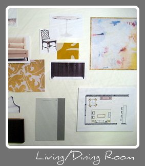
As promised, I wanted to share my final project for class, which I presented on Monday. I developed the concept board a few weeks ago for a fictional newlywed couple's new living/dining room. I am now taking the concept one step further and coming up with the final design plan for the client. The design board includes all of the items to be used in the space - furnishings, accessories, fabrics, flooring...everything.

(Click for larger image)

The colors play off the inspirational image, and I added gray to the wall and some fabrics to sort of cool things off and tone the bright yellow down. When I created the concept board, I was trying to keep to a yellow and gray palette, but ultimately I am glad I brought in a couple of accent colors. I wanted to keep things sort of fun since the couple is young, and the condo has wrap-around windows with lots of light.


floorplan and elevation


And there you have it! I still need to work on improving the way I design my boards. There were some really great ones in the class. It's sort of sad that this is the last assignment...so I will have to keep practicing on my own.

I actually did not receive too much feedback from the teacher or classmates, so please feel free to comment! I am very open to suggestions as I want to keep learning and improving. Also, if you have questions about any of the items on the board, please let me know.

2.23.2010

Mood Board - for Class

Hello! I am getting a late start to the week here - my weekend ended up being so hectic and I feel like I'm slowly making progress on everything I need to get done. One of which was completing another concept board for my class.

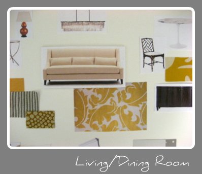
As I mentioned before, this class is all about designing a room for a fictional newlywed couple. We could design as we wish with the floorplan he gave us. I decided to try to expand on a mood board I created last year. I thought the cheery yellow and grey color scheme would be great for their living/dining room, as it is a space with windows spanning an entire wall.

The room was inspired by the same Elizabeth Schuppe image that drove the original mood board:

To be honest, the execution didn't go quite as I envisioned in my head due to a lack of selection of fabrics at my two local stores. I just couldn't find quite what I was looking for, and when I would print fabric swatches off the internet, it just didn't look as presentable. So this is the end result, for now:


Next, we are using this concept to develop a full presentation board, which includes all of the items to be used in the room, including accessories. I'm hoping to change a few things from this board as well, so hopefully the end result will turn out well.  

I would love to hear it if you have any advice on where to get free fabric samples! I suppose that is one limitation from not going to a design school with a resource center.

1.25.2010

Mood Board - For My First Client!

Hello! So I am happy to report that I met with my client yesterday, and it went well! She is actually really happy with my suggestions! I'm so excited.

As I mentioned before, I had originally sent her some images over email, but she was less than enthusiastic about a few of the suggestions. Part of the reason was that it was hard to explain my vision and how the items correlated simply by sending her images over email. Anyway, I made a few changes and stuck to some of my design ideas, and in the end having the presentation made all the difference.

I took a picture of my design board to share here, but I was in a hurry and had the camera in the wrong setting... but I digitally created the two mood boards, that I included along with some drawings, so I will share those for now. Here is the living room:


The green background is the wall color, which my client had just recently painted, so that was staying. The brown ottoman is a part of a leather sectional, which also had to stay. This mood board just shows some of the accent pieces we'd add. The mirror was one of the items she didn't like at all at first (though actually I suggested one that's a bit more subtle - this one is shown here because I couldn't remove the white background of the other!) But after showing it to her in my drawing, she started to see why I made that choice, and is now considering getting something similar.

And here is the adjacent living room, which is only separted by a low wall:


My agreement with her was that I'd suggest my ideas, but she'd go out and actually make the purchases. So now I'll just wait until she does, then I'll come back and help put the finishing touches in the room, and take pictures. I'll certainly let you know when that time comes - I can't wait!

Images created by me, through various sources. If you have questions about any specific items, please let me know.

10.04.2009

School Projects - Color Theory

I'm back, relaxed and ready for another week! The trip was wonderful, but now I am ready to enjoy the beautiful fall weather we are having, and to start my supposedly less stressful life (now that I don't have school.)

As promised, I wanted to share my projects from the Color Theory class I took this summer. I debated over sharing these because they are really not that exciting, but my goal with this blog was to share with you all the steps I am taking on my interior design journey, so here it is. I actually really enjoyed the class, and learned a lot about mixing colors and coordinating color schemes, even though many of them seemed more geared towards, say, graphic design as opposed to interiors.

The first project we did was the color wheel. We were asked to make them look interesting, so I did mine in 3D.

One of my favorite projects was taking an existing painting (mine is by Katherine Dreier) and change the color scheme. It went from a mostly primary scheme to a tertiary one with red-violet, yellow-orange and blue-green. I traced it, then painted it with acrylics.

This one is a visual representation of a song. I chose "Faithless" by Social Distortion. I won't go into detail of the meaning, but it has to do with being afraid of "breaking down your wall" and falling in love.

Finally, a project related to interior design! We could use any image we wanted (of anything), or create our own. Because I was itching to draw interiors, I decided to trace this bedroom picture, which you may recognize from Domino. The entire artwork was colored in pencils using the pointillism technique (a la Seurat) - yeah, it took FOREVER!

We did a couple more projects but they were not my best :). I definitely would not consider myself an artist - you should see what some of my classmates were doing. Nonetheless, I hope you enjoyed this small glimpse into my school work.

6.24.2009

School's Out!

I've been busy wrapping up my class this quarter, and it's finally over! I typically take two classes per quarter, but this time I only took one class but it was so demanding, I managed to be busier than I was before. I'm excited about having a break before going into the summer quarter and hopefully I'll be able to work on some projects around the house!

Because I didn't take any art classes when I was in college the first time around, I've had to start completely from scratch. This means drawing classes, 2- and 3-D Design, Art History...all of the foundation classes. Here's a sample of the work I've done so far:


Drawing Foundations


3D Design

As you see, I haven't been able to jump right into Interior Design (though I have already taken Intro to Drafting.) But I have learned so much so far about composition, shading, scale and balance - skills that I will always incorporate into designing interiors. It's been a great experience. Next quarter I take Color Theory, and I am really excited about that class!

Drafting

So there you have it...a small glimpse into the baby steps towards my dream career!


Related Posts with Thumbnails