Showing posts with label green. Show all posts

4.22.2011

DC Design House - Iantha Carley Interiors

Happy Good Friday! I hope you all have something fun planned for this weekend. I have Sunday off (a first in a few months!) so I am looking forward to celebrating Easter and spending some quality time with family.

Anyway, I wanted to wrap up my virtual tour of this year's DC Design House with a gorgeous bedroom and dressing room by Iantha Carley Interiors.


Iantha was inspired by the David Hicks La Fiorentina fabric (one of my all-time favorites!) in the green and white colorway, which she used to create a canopy above the bed as well as the curtains.


The result is a happy yet sophisticated master bedroom. 


Iantha also decorated the walk-in dressing room.  This whimsical, stylish room is any woman's dream! I love the pop of turquoise in the chandelier!


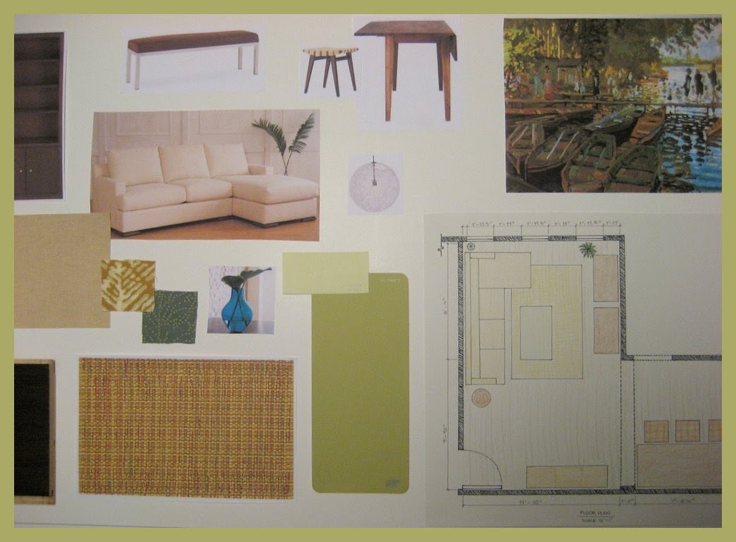
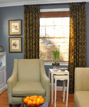
Iantha also had the opportunity to design a room in the 2009 Design House. Check it out:


And that wraps up my posts of this year's house. I hope you enjoyed it! For the locals, the Design House is still open until May 8, so you still have a chance to see it if you haven't!

Images: first three, my own. Dressing Room, Lydia Cutter. All others, Iantha Carley portfolio

4.23.2010

Small, Cool Studio Apartment

I've been spending some time browsing through the entries of the Small, Cool 2010 contest over at Apartment Therapy. I'm always so impressed with the talent of the owners/renters of these tiny spaces! So much inspiration there. One of my favorites is this:


How cozy does that alcove look? I'm also loving the rug, pillows and that vase! Such a cute studio apartment.

See the rest of the entries here. Have a great weekend!

3.15.2010

Potential Color Scheme for Living Room

Good morning! I hope you enjoyed your weekend. I managed to work my way into feeling more confident about my future (thanks in part to your sweet comments in this post), started to map out my plans, and spent lots of time finishing up a design board for class, which I will share with you later this week.

I recently mentioned that I'm considering a new color scheme for my living/dining room. My husband and I have been at our condo for nearly two years now, and will probably be there for another two, so I thought it would be a good time for a change. Only issue is coming up with something that can 1) work with some of my existing pieces, and 2) my husband will approve of (the toughest part!)

For my design board for class, I ordered a few fabric samples online. Turns out that 4 out of the 6 fabrics I ordered did not work for my project, but managed to perfectly coordinate with each other. Online they appeared gray, but turn out to be a lovely seafoam green-ish shade. For my school project, I'm using gray and yellow, and suddenly, when these colors were all next to each other, I realized I had a great color scheme in front of me:


Even more coincidentally, the shades pefectly match a vase I've owned, which I actually bought right before moving into the condo in hopes to go with a similar color scheme (see my inspiration board here). We ended up going with blue, but now I may go back to that original plan.

The walls will probably be a neutral gray, so that I can more easily change the accent color should I get bored (which, knowing me, will happen.) Oh, and the hubby actually likes it! What do you think?

1.25.2010

Mood Board - For My First Client!

Hello! So I am happy to report that I met with my client yesterday, and it went well! She is actually really happy with my suggestions! I'm so excited.

As I mentioned before, I had originally sent her some images over email, but she was less than enthusiastic about a few of the suggestions. Part of the reason was that it was hard to explain my vision and how the items correlated simply by sending her images over email. Anyway, I made a few changes and stuck to some of my design ideas, and in the end having the presentation made all the difference.

I took a picture of my design board to share here, but I was in a hurry and had the camera in the wrong setting... but I digitally created the two mood boards, that I included along with some drawings, so I will share those for now. Here is the living room:


The green background is the wall color, which my client had just recently painted, so that was staying. The brown ottoman is a part of a leather sectional, which also had to stay. This mood board just shows some of the accent pieces we'd add. The mirror was one of the items she didn't like at all at first (though actually I suggested one that's a bit more subtle - this one is shown here because I couldn't remove the white background of the other!) But after showing it to her in my drawing, she started to see why I made that choice, and is now considering getting something similar.

And here is the adjacent living room, which is only separted by a low wall:


My agreement with her was that I'd suggest my ideas, but she'd go out and actually make the purchases. So now I'll just wait until she does, then I'll come back and help put the finishing touches in the room, and take pictures. I'll certainly let you know when that time comes - I can't wait!

Images created by me, through various sources. If you have questions about any specific items, please let me know.

12.03.2009

DIY's Around The House - Part 1

I have been mentioning a few scattered projects around the house, and I finally got my act together and finished a few of them (and took photos!) They were all very simple, affordable touches that are slowly making my condo look more like home. The two I am showing today, barstools and a pillow, were both using the Carla Miller for Rowan Fabrics that I mentioned in a previous post. The fabric actually inspired my living/dining room color scheme of turquoise, green and a few purple accents.


Too bad my husband hates it! Whenever he looks at it, he starts singing "Electric Avenue" by Eddy Grant, haha. Still, he was sweet enough to help me re-upholster the barstools. I have had these for a few years and don't feel ready to replace them, as there is nothing "technically" wrong with them. But they looked a little too traditional and I thought I could easily change that. Here is the before:


And here is their "Electric Avenue" makeover:


Yes, they really are a bit "out there," but against the blue walls, I like them. Definitely better than the boring beige! This was a very inexpensive and easy fix.


Next up, the pillow. This old chair was the entire reason for the fabric selection. It has a weird greenish-gray tone (because it's so old), and it just stuck out. Now, the colors all sort of blend together and it makes me feel much better about not being able to replace this chair for a while.


So there you have it, super easy fixes to make your old furniture feel like new again! Or, at least more bearable! Soon I'll show you the other pillows (for the bedroom), a couple more small projects, and the dining room, FINALLY! The barstools were the final step to finishing up that room (well, for now...are we really ever done decorating?) 

11.30.2009

Mood Board - Monet Inspired

Good morning! I hope you had a wonderful Thanksgiving. Mine was great, with lots of eating, shopping and spending time with friends and family. Only thing is I didn't work on as many projects as I had hoped. It seems no matter how many days we have off, it is never enough! However, I had time for a sewing session with my mom, so I finally made pillows for the bedroom and living rooms. I hope to show you sometime this week.

I spent the rest of my break working on a design board for class. We were to design a living/dining room for a single male who loves to read and occasionally entertain. The teacher asked us to use an artwork or a favorite place to travel as inspiration. I ended up choosing a Monet piece, Bathing at La Grenouillere. I chose it primarily for the colors (yet again with the green!) Here it is:


Furniture and accessories are from Kravet, DWR, Room and Board, and Crate and Barrel. Fabrics are from G Street Fabric.


Close-up of artwork and floorplan:


Have a great week!

11.04.2009

Decorating with Green

First, I wanted to mention that my class on Monday night was wonderful! I am so happy I signed up for the course. I'm officially going to pursue decorating (as opposed to Interior Design) and I'm very happy with my decision. No more spending thousands of dollars on school and killing myself studying while working full time. This way I will be done much quicker and still get to do what I love!

Now to today's post. I'm noticing that many pictures I've been saving lately have had some green in them. I must admit green was never one of my favorite colors, so I am not sure where the shift is coming from. I'm even using green as an accent color in my living/dining room (which is still very much a work in progress!) I guess I always thought of green as more of an "earthy" color (duh) used with beiges in more traditional or "country" schemes - which is just not my thing. Lately though, rooms that feature green look so chic! Check it out: 


 Sarah Richardson, HGTV Canada - Check here for more pics of this room - it is so nice!


How do you feel about green?
Related Posts with Thumbnails